
Walk into a house where everything just feels right and it’s rarely one dramatic feature doing the heavy lifting. More often, it’s the quiet consistency. The staircase complements the doors. The windows echo the same tones. Nothing shouts for attention, yet everything works together.
On the other hand, I’ve seen hallways where a beautiful oak staircase sits beside bright white uPVC windows and dark walnut doors. Each element may look fine on its own, but together they feel slightly confused.
Creating a cohesive look isn’t about making everything identical. It’s about coordination — in material, tone, proportion and detail.
In most homes, one element naturally carries more visual weight. Often, that’s the staircase. It sits in the hallway, usually central, and tends to draw the eye.
If your staircase is already installed, treat it as the anchor. Work outward from there when selecting doors and window finishes.
If you’re renovating from scratch, you have more flexibility. In that case, consider which feature you want to stand out. Do you want a striking staircase? Or would you prefer understated stairs and characterful timber windows?
Establishing a visual hierarchy early prevents costly mismatches later.
Matching timber can be surprisingly tricky.
Oak alone comes in dozens of shades, from pale honey to deep caramel. Add walnut, ash, sapele or painted finishes into the mix and the options multiply quickly.
Perfectly matching timber across staircase, doors and windows may sound ideal, but in reality it’s rarely necessary. In fact, slight variation often feels more natural.
Instead, aim for harmony:
Keep undertones consistent (warm with warm, cool with cool).
Avoid clashing stains (for example, reddish mahogany against pale grey-washed oak).
Use similar finishes — all matt, all satin, or all oiled.
If your staircase features natural oak treads and handrails, pairing them with oak-veneered internal doors usually creates a unified look. They don’t need to be cut from the same tree. They simply need to sit comfortably together.
Painted staircases introduce far more freedom.
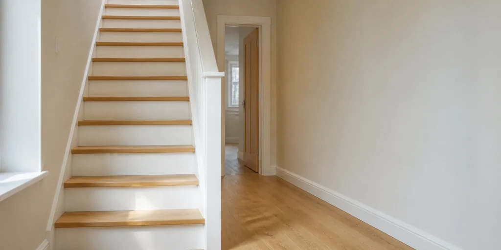
White or off-white spindles and stringers can complement both timber and painted doors. In many UK homes, a classic combination appears to be painted risers with timber treads — a practical and timeless approach.
When coordinating painted elements, consistency in shade matters. “White” is not one single colour. Mixing cool bright white with warm cream can create subtle tension.
If your windows are white uPVC, it often makes sense to paint balustrades in a similar tone. This visually ties the vertical lines of the staircase to the window frames without overwhelming the space.
Period properties usually benefit from coherence rooted in their original design language.
Victorian and Edwardian homes often feature:
Panelled internal doors
Sash windows
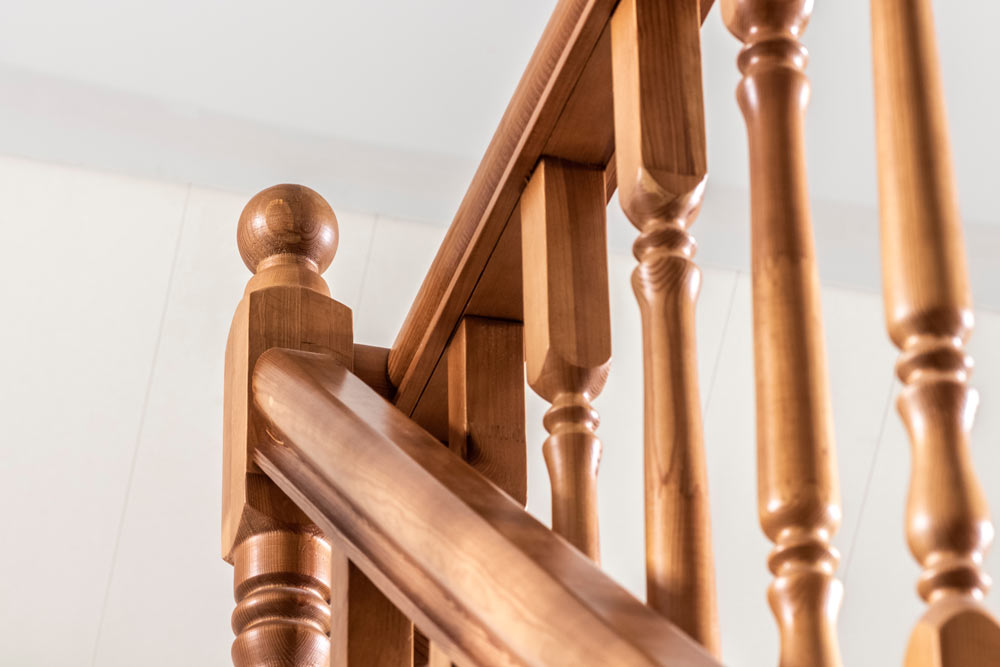
Decorative stair spindles
Replacing ornate balusters with ultra-minimalist glass may feel jarring unless the rest of the home has been modernised accordingly.
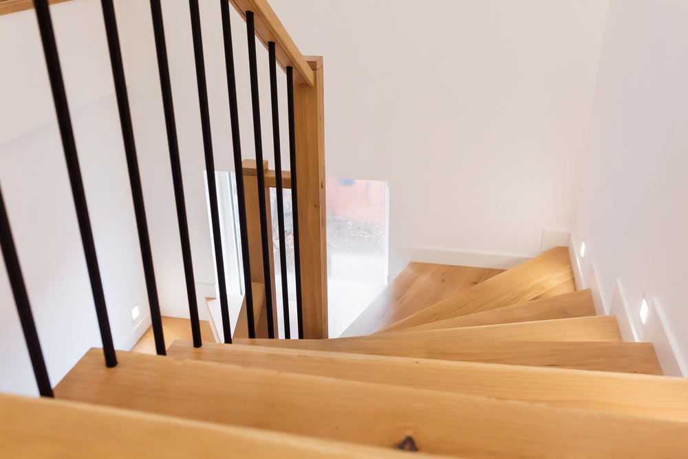
In contrast, contemporary homes with large glazed openings and flush internal doors suit clean-lined staircases. Glass balustrades and square newel posts often feel more at home here.
That said, subtle contrast can work beautifully. I’ve seen period homes retain original panelled doors while introducing a simplified oak staircase — not traditional, not ultra-modern, but somewhere in between. It felt considered rather than forced.
Cohesion goes beyond colour and wood species.
Look closely at profiles and detailing:
Are your internal doors shaker-style with square edges?
Do your window architraves have decorative mouldings?
Is your staircase handrail chunky and traditional or slim and contemporary?
These details should speak the same design language.
For example, pairing heavily moulded doors with a completely flat, minimalist staircase can feel inconsistent. The same applies in reverse — ornate stair spindles beside sleek flush doors might look slightly out of sync.
Even small elements like skirting boards and architraves influence the overall result. When these components align stylistically, the entire hallway feels intentional.
Glass has become increasingly popular in staircase design, particularly in modern homes.
If your property features large aluminium or timber-framed windows, glass balustrades can echo that transparency and bring cohesion. Light flows more freely, and the staircase feels less bulky.
However, in smaller traditional homes with modest window openings, too much glass can feel out of place. In those settings, timber balustrading often provides warmth that complements the proportions of the windows.
It’s less about trend and more about balance.
Door handles, window furniture and staircase brackets are small details, yet they quietly influence cohesion.
If your doors feature brushed stainless steel handles, black metal balustrade fittings may feel inconsistent. Likewise, antique brass door furniture might clash with ultra-modern chrome accents on the staircase.
Coordinating finishes — whether that’s matte black, satin chrome, polished brass or something more understated — ties the scheme together without demanding attention.
You don’t need to match every hinge precisely. But aligning general finish tones helps the space feel resolved.
Stand at your front door and look through the hallway. What do you see?
In many homes, you’ll notice:
The staircase rising ahead
Internal doors branching off
Light streaming through rear windows
These elements often appear within the same line of sight. If they contrast too heavily, the space can feel fragmented.
Open-plan layouts amplify this effect. In properties where the staircase is visible from living or kitchen areas, coordination with window frames and patio doors becomes even more important.
Sometimes, simply adjusting stain depth or paint tone can soften visual clashes.
Flooring frequently acts as the bridge between staircase, doors and windows.
Timber flooring that complements stair treads creates continuity. Even in carpeted homes, choosing a stair runner that echoes door tones can subtly unify the space.
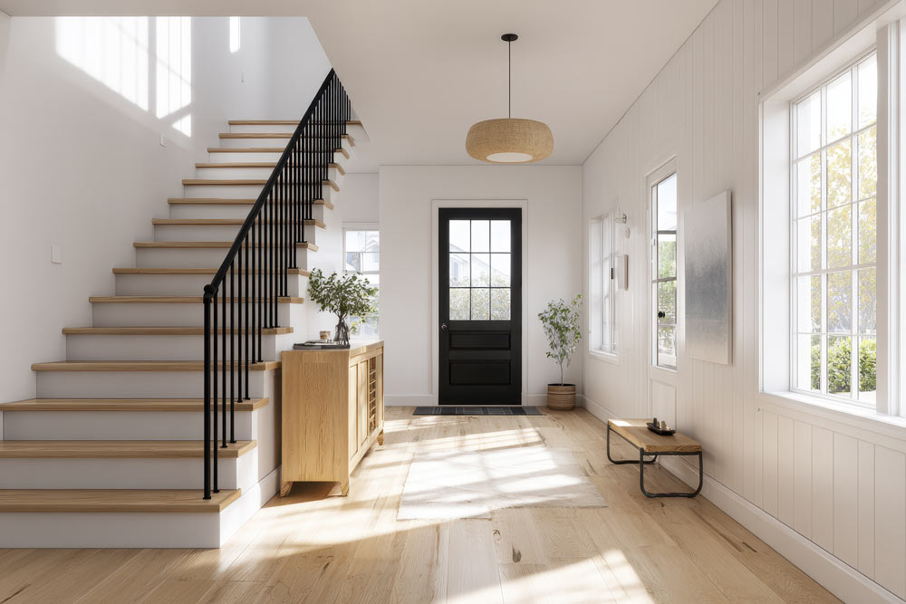
For example, natural oak stairs paired with warm-toned engineered oak flooring often feel seamless. Meanwhile, cool grey flooring beside warm oak doors might require thoughtful balancing through paint colours.
The floor is not separate from the equation. It plays a central role.
There’s a fine line between cohesive and overly uniform.
A hallway where every element is identical in colour and finish can feel flat. Contrast, when handled carefully, adds depth.
Perhaps the staircase is oak, the doors are painted, and the windows remain crisp white. That variation can feel fresh, provided the undertones align and the detailing doesn’t clash.
Cohesion isn’t about uniformity. It’s about compatibility.
One of the most common issues arises when homeowners upgrade elements in stages.
They install new oak doors, then years later replace the staircase with a different timber tone. Or they modernise the staircase but retain dated window frames.
Whenever possible, think holistically. Even if the full renovation isn’t happening immediately, selecting finishes with future upgrades in mind reduces the risk of mismatches later.
Mood boards, physical samples and even temporary placement of materials side by side can help visualise outcomes before committing.
Matching staircases with doors and windows for a cohesive look requires more observation than guesswork. Pay attention to tone, detail, proportion and how each element interacts within the space.
You don’t need everything to be identical. In fact, you probably shouldn’t aim for that. Instead, seek harmony — materials that complement rather than compete.
When done thoughtfully, the result feels effortless. Visitors may not consciously notice the coordination, but they’ll sense that the space works. And that quiet consistency is often what makes a home feel truly complete.